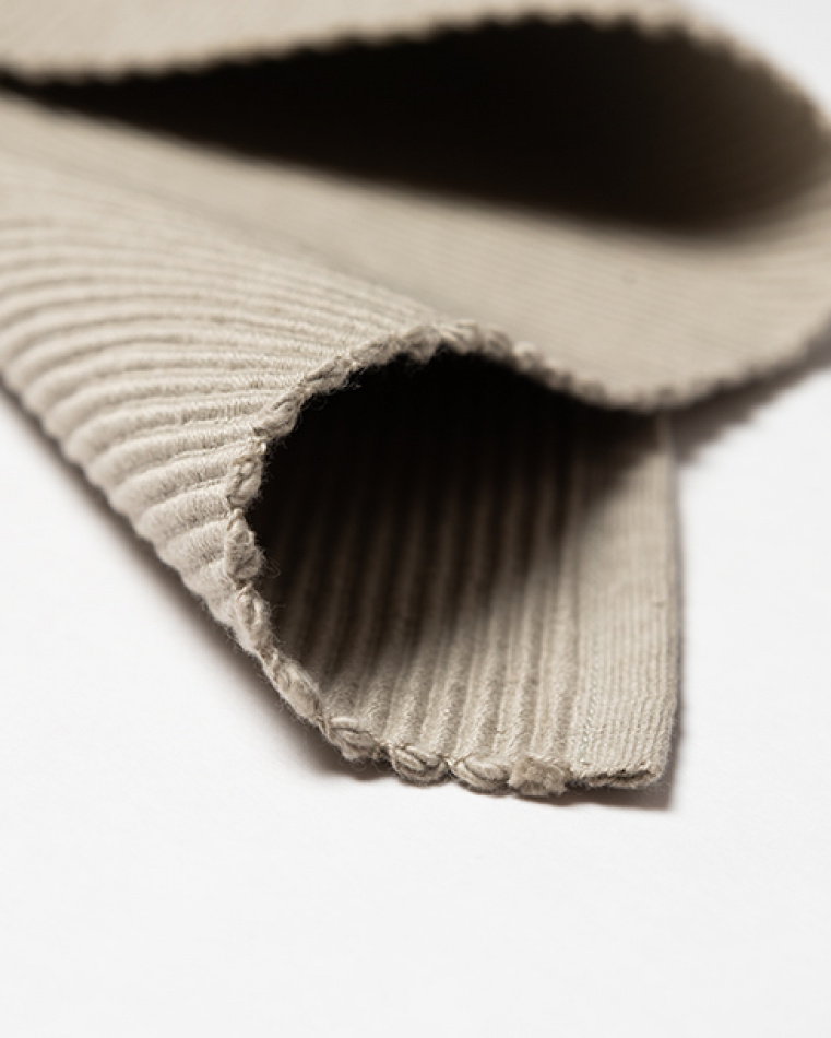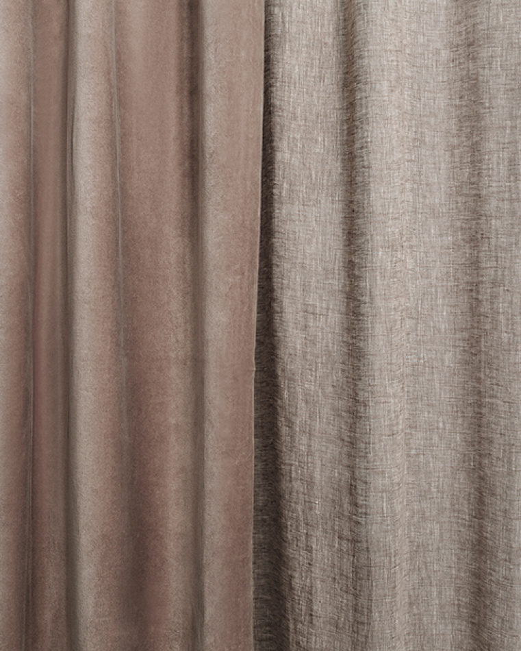
LINUM’s curtain guide; part 1.
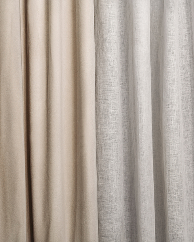
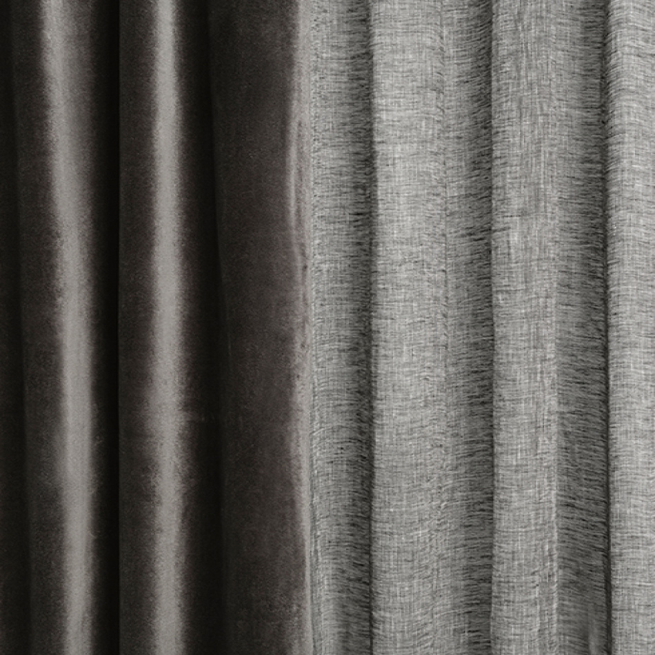
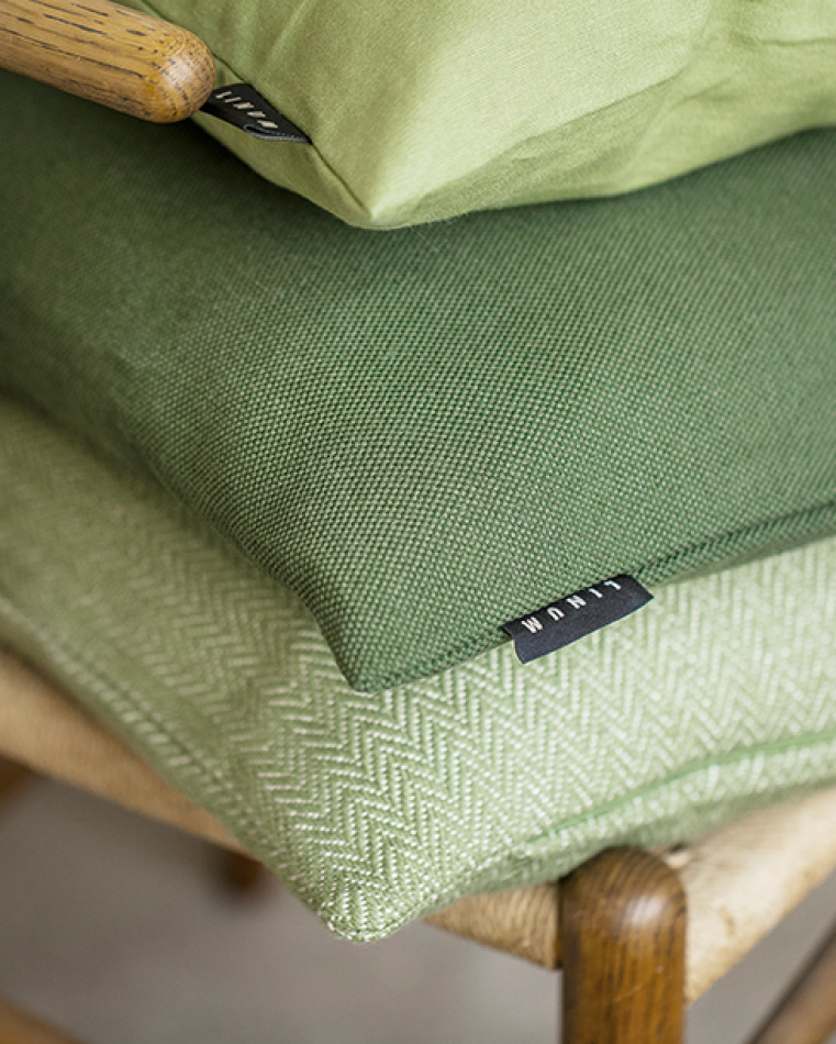
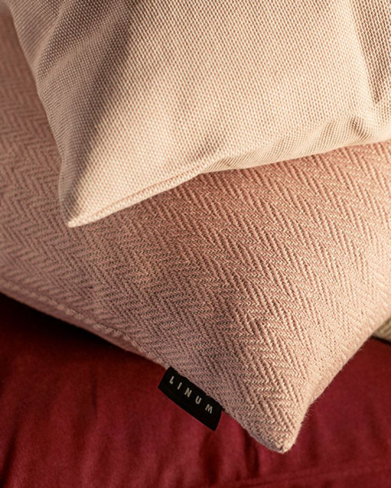
What length of curtains should I buy? How do I adjust them to my window? What are pin hooks and how do I attach them for perfect pleats? You may have all kinds of questions when you come to buy these popular soft furnishings. But help is at hand! Benefit from our long-standing experience and expertise in curtaining products. In this first part of our curtain guide we discuss the selection of colours and materials.
Read more