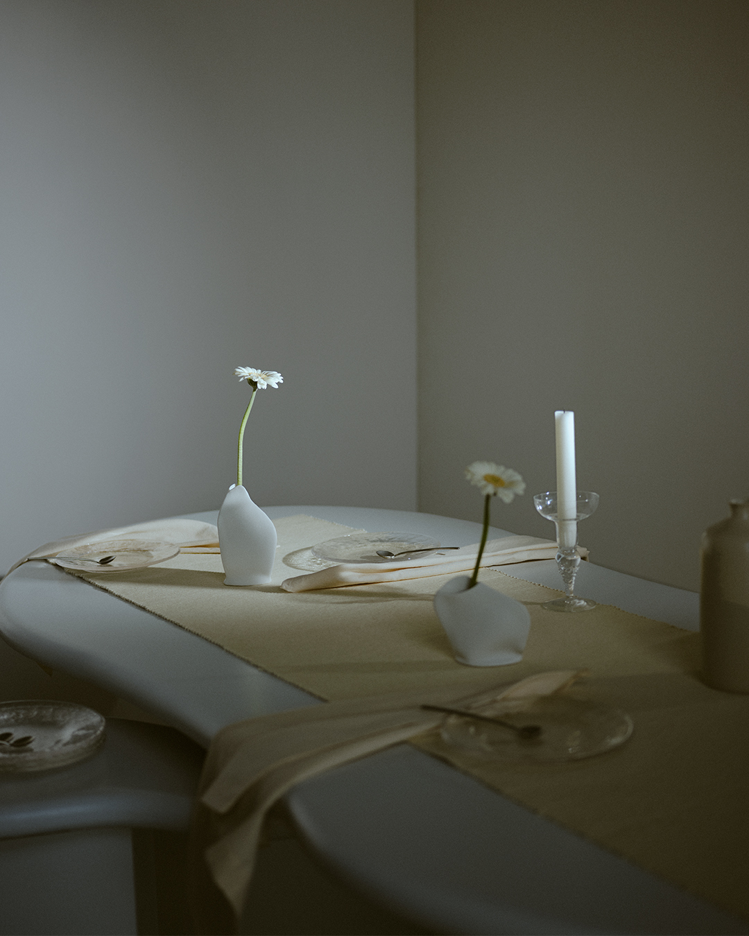
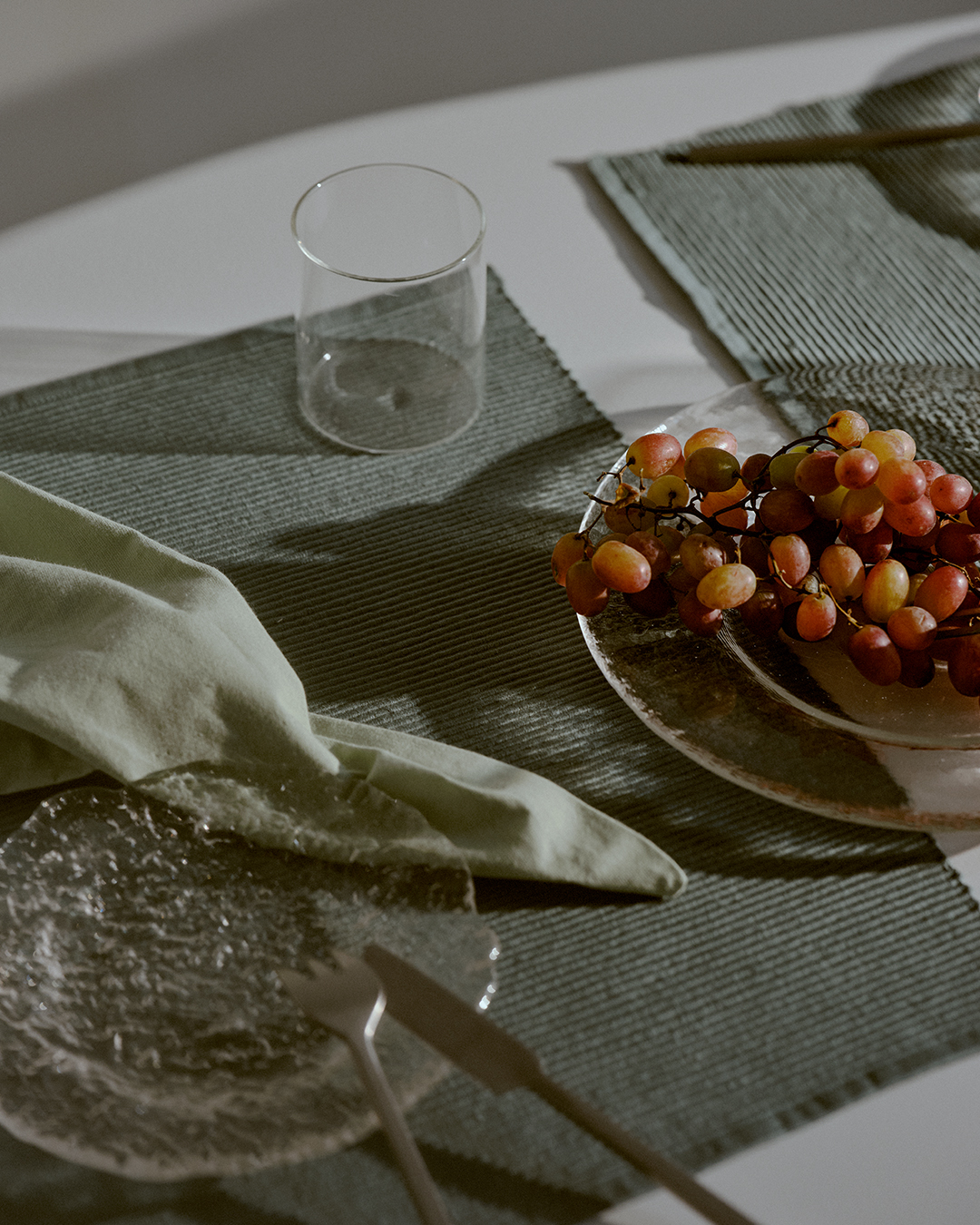
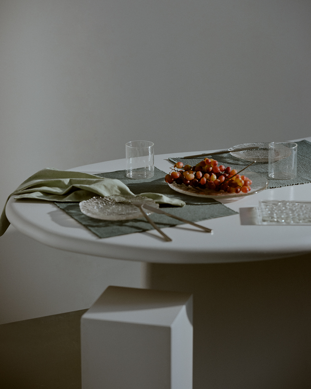
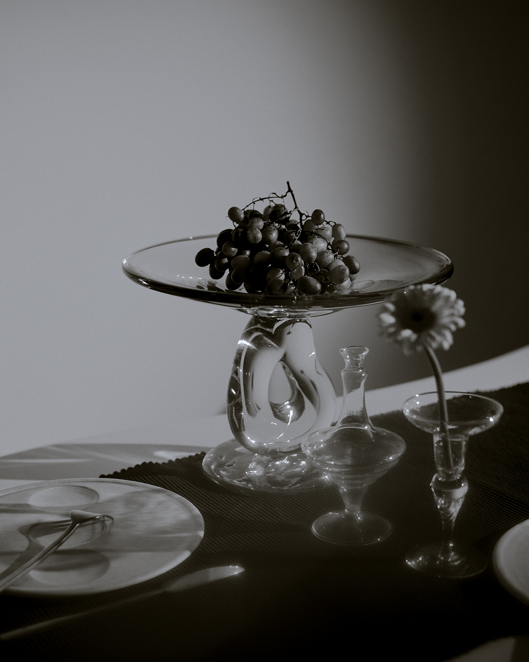
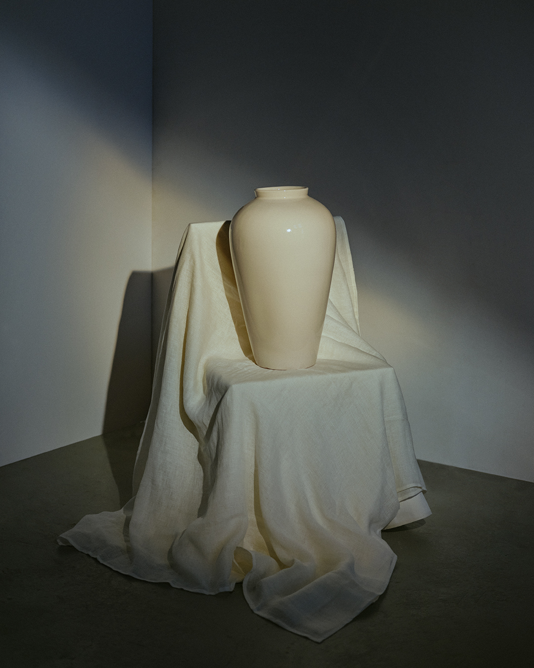
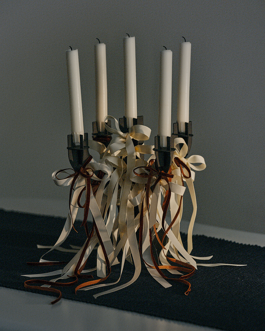
Fanny Hamlin interprets LINUM.
Fanny Hamlin on her interpretation.
"The idea of a picture always starts when I see something that inspires me. This could be a photo, a painting, a movie, or just something as simple as a shape or a colour. I love building scenes and rooms where reality doesn't have to be the main focus, but where the idea speaks for itself. The tones and materials of LINUM's products make it easy for me to get an instant sense of the image, and makes me want to create even more. I love the simplicity and structure of UNI, and the colours make me long for cosy breakfasts in the cold January light."
Fanny Hamlin on her inspiration.
"Ever since I saw Paul Thomas Anderson's film Phantom Thread, I've had this urge to create a set table. In the film, he drops the camera on the table for a few seconds before the scene continues. It was enough to spark my inspiration and get my brain cogs turning. And my everlasting love for Maison Margiela's perfect white shade has played a big role in the images."
LINUM on the winter colour palette.
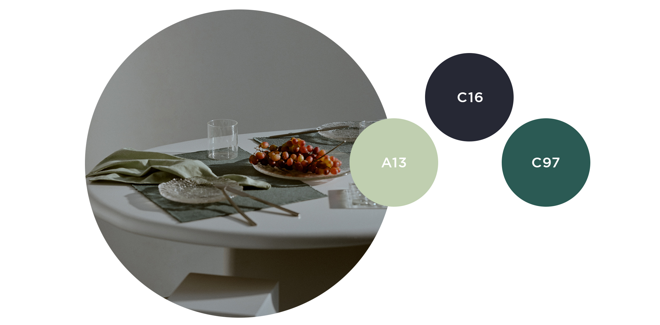
We see a new mix taking shape when we combine the latest dark blue (C16) with ice green (A13) and dark (C97) grey turquoise. When we move away from the timeless blue/white combination in favour of a more temporary palette, the white comes into its own and really breaks through. Ice green is one of LINUM's most sought-after shades, and when combined with dark grey turquoise, the result is a stylish duo. Where we used to prefer black, we are now filling in with dark blue, and suddenly new, creative ideas are emerging around textile looks.
